From data to plots
Exploring the penguins data
A very well known dataset in the R community is the palmerpenguins dataset. It contains data about penguins, including their species and some ecological measurements. Let's load the data and take a look at it.
using Tidier #exports TidierPlots.jl and others
using DataFrames
using PalmerPenguins

penguins = dropmissing(DataFrame(PalmerPenguins.load()));
The penguins DataFrame contains the following columns (from TiderData.jl let us take a glimpse):
@glimpse penguinsRows: 333
Columns: 7
.species InlineStrings.String15Adelie, Adelie, Adelie, Adelie, Adelie, Ade
.island InlineStrings.String15Torgersen, Torgersen, Torgersen, Torgersen,
.bill_length_mm Float64 39.1, 39.5, 40.3, 36.7, 39.3, 38.9, 39.2, 41.1, 38
.bill_depth_mm Float64 18.7, 17.4, 18.0, 19.3, 20.6, 17.8, 19.6, 17.6, 21
.flipper_length _mmInt64 181, 186, 195, 193, 190, 181, 195, 182, 191, 19
.body_mass_g Int64 3750, 3800, 3250, 3450, 3650, 3625, 4675, 3200, 38
.sex InlineStrings.String7male, female, female, female, male, female,A simple TiderPlots.jl scatterplot
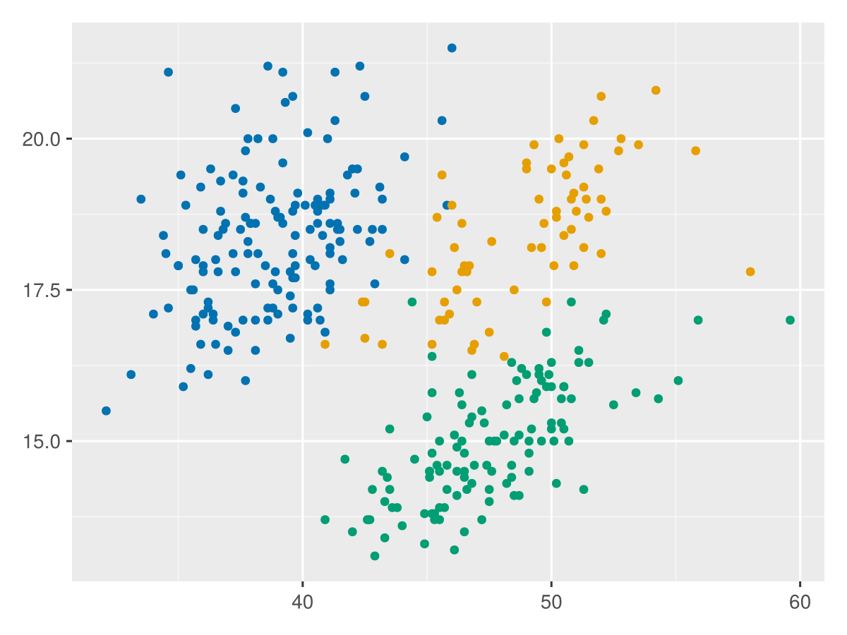
Now the experience to plot using TidierPlots.jl will be as seamless as in R. Let's start by plotting the bill_length_mm and bill_depth_mm columns.
ggplot(penguins, @aes(x=bill_length_mm, y=bill_depth_mm, color = species))+
    geom_point()
This is not R code, its pure Julia. And if you are familiar with R, you will find it very similar. The ggplot function creates a plot object, and the geom_point function adds a scatter layer on top of it. The @aes macro is used to map the variables of the penguins DataFrame to the aesthetics of the plot. In this case, we are mapping the bill_length_mm column to the x-axis, the bill_depth_mm column to the y-axis, and the species column to the color of the points. The output is a scatter plot of the bill_length_mm and bill_depth_mm columns, colored by the species column.
Now, @aes() is used to map variables in your data to visual properties (aesthetics) of the plot. These aesthetics can include things like position (x and y coordinates), color, shape, size, etc. Each aesthetic is a way of visualizing a variable or a statistical transformation of a variable.
Aesthetics are specified in the form aes(aesthetic = variable), where aesthetic is the name of the aesthetic, and variable is the column name in your data that you want to map to the aesthetic. The variable names do not need to be preceded by a colon. This is the first difference you might encounter when using TidierPlots.jl, and the best part is that it also accepts multiple forms for aes specification, none of which is exactly the same as ggplot2.
Option 1: @aes macro, aes as in ggplot2:
@aes(x = x, y = y)Option 2: @es:
@es(x = x, y = y)Option 3: aes function, julia-style columns:
aes(x = :x, y = :y)Option 4: aes function, strings for columns:
aes(x = "x", y = "y")Customizing the plot
Moving from general rules, to specific plots, let us first explore geom_point()
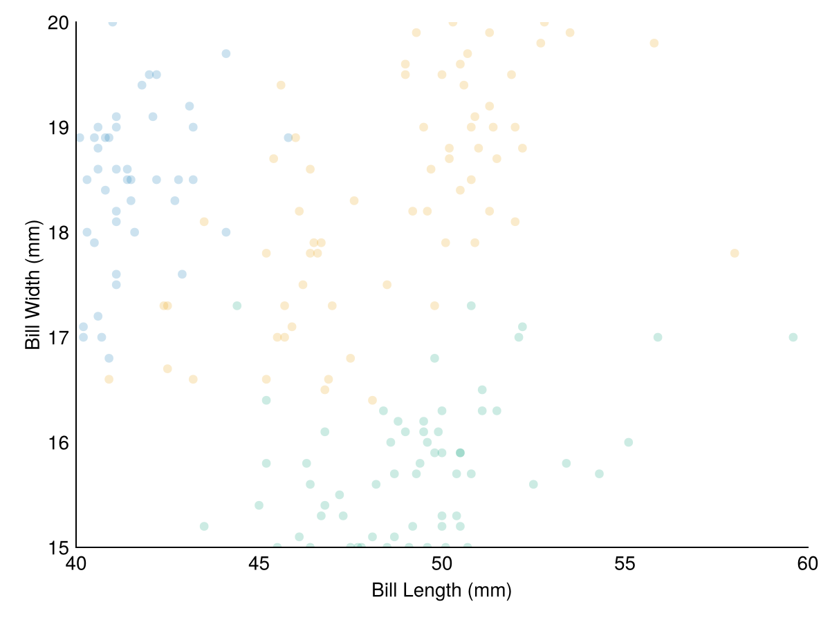
geom_point() is used to create a scatter plot. It is typically used with aesthetics mapping variables to x and y positions, and optionally to other aesthetics like color, shape, and size. geom_point() can be used to visualize the relationship between two continuous variables, or a continuous and a discrete variable. The following visuals features can be changed within geom_point(), shape, size, stroke, strokecolour, and alpha.
ggplot(penguins, @aes(x = bill_length_mm, y = bill_depth_mm, color = species)) +
    geom_point(
        size = 20,
        stroke = 1,
        strokecolor = "black",
        alpha = 0.2) +
    labs(x = "Bill Length (mm)", y = "Bill Width (mm)") +
    lims(x = c(40, 60), y = c(15, 20)) +
    theme_minimal()
To see more about the TidierPlots.jl package, you can visit the documentation.